AndroidStudioのレイアウトには、ConstraintLayout,RelativeLayout,LinerLayout,TableLayout,GridLayoutの5種類が大きく分けてあります。
それぞれの違いをざっと説明すると、
ConstraintLayoutはiOSアプリ開発をしたことがある人ならわかるかと思うのですが、AutoLayoutと似ているもので、感覚的にコードを書かなくてもレイアウトをすることができます。
RelativeLayoutは相対的なレイアウトという言葉から察するに、親のViewやButton、Imageに対して位置が自動的に配置されます。ですから、例えば、初期設定でどんどんButtonを作ってしまうと重なってしまい本当にButtonが作れたのかわからなくなります。ズームすることで重なっているのを理解することができます。
LinerLayoutはラインどりという言葉があるようにきちっと並ばせてくれるレイアウト方法です。先ほどと同じようにButtonをどんどん初期設定で作ったら横並びか縦並び指定方法によって違いますが、並べてくれます。
詳しくみていきます。
RelativeLayout
- OSバージョンによる違いが発生する
- 表現力が足りない
初期設定ではxmlファイルの上部の一番最初にどんなレイアウトか指定されています。
デフォルトの状態では
<?xml version="1.0" encoding="utf-8"?>
<androidx.constraintlayout.widget.ConstraintLayout xmlns:android="http://schemas.android.com/apk/res/android"
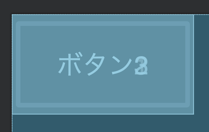
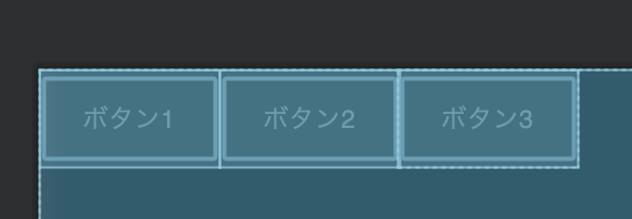
</androidx.constraintlayout.widget.ConstraintLayout>Buttonを3つ作ってみます。
それぞれテキストをボタン1ボタン2ボタン3とします。
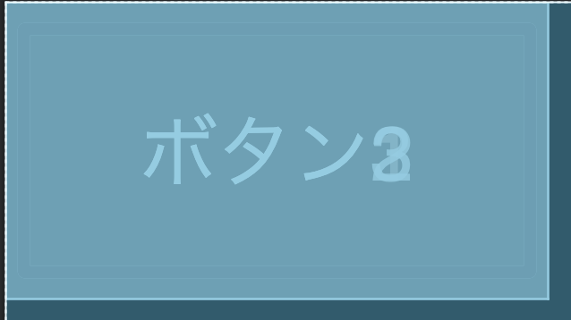
このようにconstraintlayoutが使われています。RelativeとConstraintはデフォルトでは同じ動きをします。
ここをRelativeLayoutと書いてあげると、このように変化します。
同じ動きですね。
LinerLayout
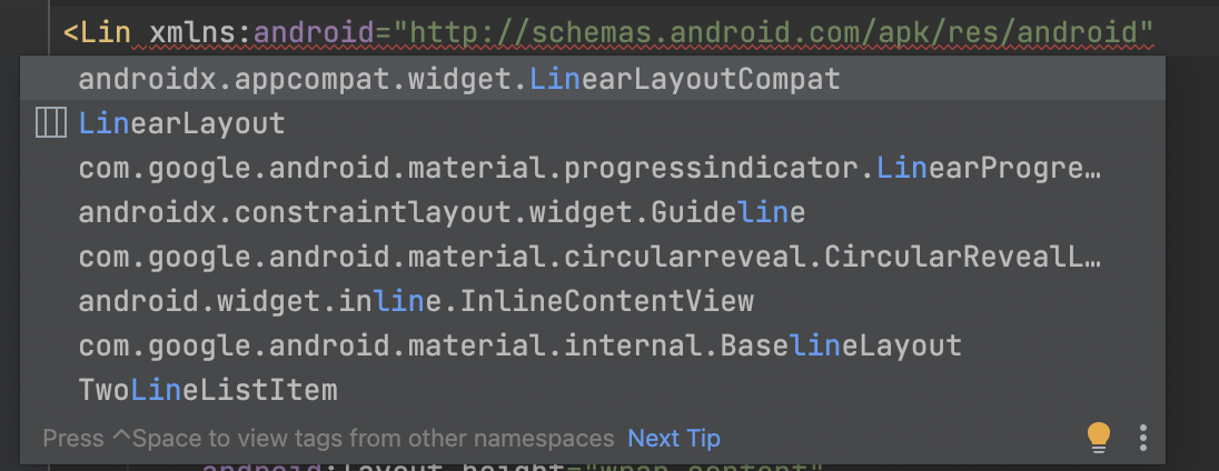
Linと打てば、LinerLayoutと候補が出てくるので、エンターを押すと以下のような並び方になってくれます。
綺麗に並んでいて使いやすそうですね。
ConstraintLayout
- ライブラリとして提供されているので、OSのバージョンによらず最新の機能を使うことができる。
レスポンシブな画面を作りやすく、ネストの必要がないので処理が早くなるみたいです。
基本的に1つの各辺に対して、制約をつけていきます。制約を他のViewとつけることによって、関係性をつけていくレイアウト方法です。
コードでの書き方は、以下の通りです。
layout_constraint自分のViewの辺_to相手のViewの辺=相手という書き方をします。
最初に各辺に対して名前がついているので覚えてください。
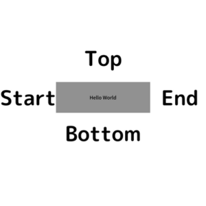
日本語は左から右に読みますが、他の言語だと右から左に読む言語もあるから。
その場合、Start、Endにしておくことでその言語でアプリを見たときにもちゃんとStart→Endで表示してくれる。
ちょっとよくわからないと思うので、実際の例で見ていきます。
 完成レイアウト
<?xml version="1.0" encoding="utf-8"?>
<androidx.constraintlayout.widget.ConstraintLayout xmlns:android="http://schemas.android.com/apk/res/android"
xmlns:app="http://schemas.android.com/apk/res-auto"
xmlns:tools="http://schemas.android.com/tools"
android:layout_width="match_parent"
android:layout_height="match_parent"
tools:context=".MainActivity">
<TextView
android:id="@+id/textView1"
android:layout_width="wrap_content"
android:layout_height="wrap_content"
android:text="Hello World!"
app:layout_constraintBottom_toBottomOf="parent"
app:layout_constraintTop_toTopOf="parent"
app:layout_constraintEnd_toStartOf="@id/textView2"
app:layout_constraintStart_toStartOf="parent"/>
<TextView
android:id="@+id/textView2"
android:layout_width="wrap_content"
android:layout_height="wrap_content"
android:text="TextView"
app:layout_constraintBottom_toBottomOf="parent"
app:layout_constraintTop_toTopOf="parent"
app:layout_constraintEnd_toEndOf="parent"
app:layout_constraintStart_toEndOf="@id/textView1"/>
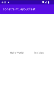
</androidx.constraintlayout.widget.ConstraintLayout>デフォルトのactivity_main.xmlで、Hello Worldが入っているのでそのTextViewと新たに付け加えたTextViewでレイアウトを説明していきます。
コードを見ていただいたらわかるかと思うのですが、
app:layout_constraintBottom_toBottomOf="parent"
app:layout_constraintTop_toTopOf="parent"
これが両方に同じく入っています。
自分のTopの辺とparentのTopの辺を揃えてねという意味になります。同じく、自分のBottomの辺とparentのBottomの辺を揃えてねということになります。
これは完成レイアウトを見て貰えばわかると思いますが、画面の縦で中央配置したい時のコードなのであまり使うことはないかもしれません。
app:layout_constraintEnd_toStartOf="@id/textView2"
app:layout_constraintStart_toStartOf="parent"
デフォルトで表示されているHelloWorldのid名textView1のEndと相手のTextViewのid名textView2のStartに対して配置するというコードになります。
同じく、textView1のStartとparentのStartを揃えてねという意味になります。
ここで疑問に持つ人がいると思います。parentに揃えてねだったり、textView1のEndとtextView2のStartはなぜ重ならないのかという疑問です。
これはChainと呼ばれるデフォルトで設定されているものが原因です。
Chain
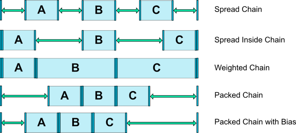
これがChainの種類です。
デフォルトではSpread Chainが設定されています。だから、複数のViewと関係を持つとき(デフォルトはHello World!と親)はいい感じに空白が調整されていたんですね。
試しによく使うPacked Chainについて見ていきます。コードを書き換えます。
app:layout_constraintHorizontal_chainStyle="packed"をHelloWorldのid名textView1に付け加えてください。
<TextView
        android:id="@+id/textView1"
        android:layout_width="wrap_content"
        android:layout_height="wrap_content"
        android:text="Hello World!"
        app:layout_constraintBottom_toBottomOf="parent"
        app:layout_constraintTop_toTopOf="parent"
        app:layout_constraintEnd_toStartOf="@id/textView2"
        app:layout_constraintStart_toStartOf="parent"
        app:layout_constraintHorizontal_chainStyle="packed" />
Runして確認してみると、揃った状態で表示されたと思います。
Chainはhead要素と呼ばれる部品に対して宣言します。
headなので頭、先頭の部品に対して、宣言するだけでレイアウトを整えることができます。
水平方向では一番左が先頭、縦表示では、一番上が先頭になります。
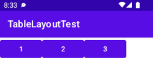
TableLayout
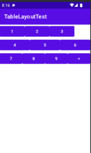 TableLayout完成レイアウト
TableLayoutとは、格子状に並べるレイアウトです。
ConstraintLayoutやLinerLayoutなどでも無理やりやればできると思いますが、効率が良くないですね。せっかく用意されているものは使った方がシステム的にも良いと思います。
<?xml version="1.0" encoding="utf-8"?>
<TableLayout xmlns:android="http://schemas.android.com/apk/res/android"
    xmlns:app="http://schemas.android.com/apk/res-auto"
    xmlns:tools="http://schemas.android.com/tools"
    android:layout_width="match_parent"
    android:layout_height="match_parent"
    tools:context=".MainActivity">

    <TableRow
        android:layout_width="match_parent"
        android:layout_height="match_parent">
        <Button
            android:id="@+id/button1"
            android:text="1"
            android:layout_width="wrap_content"
            android:layout_height="wrap_content"
            />
        <Button
            android:id="@+id/button2"
            android:text="2"
            android:layout_width="wrap_content"
            android:layout_height="wrap_content"
            />
        <Button
            android:id="@+id/button3"
            android:text="3"
            android:layout_width="wrap_content"
            android:layout_height="wrap_content"
            />
    </TableRow>

    <TableRow
        android:layout_width="match_parent"
        android:layout_height="match_parent"
        android:weightSum="3">
        <Button
            android:id="@+id/button4"
            android:text="4"
            android:layout_width="0dp"
            android:layout_height="wrap_content"
            android:layout_weight="1"
            />
        <Button
            android:id="@+id/button5"
            android:text="5"
            android:layout_width="0dp"
            android:layout_height="wrap_content"
            android:layout_weight="1"
            />
        <Button
            android:id="@+id/button6"
            android:text="6"
            android:layout_width="0dp"
            android:layout_height="wrap_content"
            android:layout_weight="1"
            />
    </TableRow>

    <TableRow
        android:layout_width="0dp"
        android:layout_height="match_parent"
        android:layout_weight="4">
        <Button
            android:id="@+id/button7"
            android:text="7"
            android:layout_width="0dp"
            android:layout_height="wrap_content"
            android:layout_weight="1"
            />
        <Button
            android:id="@+id/button8"
            android:text="8"
            android:layout_width="0dp"
            android:layout_height="wrap_content"
            android:layout_weight="1"
            />
        <Button
            android:id="@+id/button9"
            android:text="9"
            android:layout_width="0dp"
            android:layout_height="wrap_content"
            android:layout_weight="1"
            />
        <Button
            android:id="@+id/button10"
            android:text="="
            android:layout_width="0dp"
            android:layout_height="wrap_content"
            android:layout_weight="1"
            />
    </TableRow>
</TableLayout>
まず、TableLayoutを使うために、デフォルトのConstraintLayoutを消します。
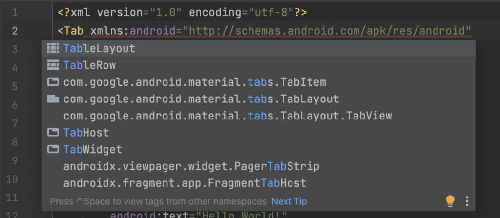
Tabと打つと、候補が出てくるのでEnterを押しましょう。
次に、
<TableLayout>
    <TableRow>
        <Button/>
        <Button/>
        <Button/>
    </TableRow>
</TableLayout>
にしないといけないので、TableRowを書きます。候補が出てくるので、Enterを押しましょう。
Rowとは、横1列のことを指しています。今回は3段作るので、このTableRowを3つ作ります。
<Button/>を3つ、3つ、4つの数で配置します。
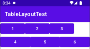
1段目をデフォルト表示、2段目を均等表示、3段目を4つの場合の均等表示にするためこのような数に指定しています。
<TableRow
        android:layout_width="match_parent"
        android:layout_height="match_parent">
        <Button
            android:id="@+id/button1"
            android:text="1"
            android:layout_width="wrap_content"
            android:layout_height="wrap_content"
            />
        <Button
            android:id="@+id/button2"
            android:text="2"
            android:layout_width="wrap_content"
            android:layout_height="wrap_content"
            />
        <Button
            android:id="@+id/button3"
            android:text="3"
            android:layout_width="wrap_content"
            android:layout_height="wrap_content"
            />
    </TableRow>
普通に書くとこのようになります。左寄りで、不自然な感じですね。
整えていきます。
<TableRow
        android:layout_width="match_parent"
        android:layout_height="match_parent"
        android:weightSum="3">
        <Button
            android:id="@+id/button4"
            android:text="4"
            android:layout_width="0dp"
            android:layout_height="wrap_content"
            android:layout_weight="1"
            />
        <Button
            android:id="@+id/button5"
            android:text="5"
            android:layout_width="0dp"
            android:layout_height="wrap_content"
            android:layout_weight="1"
            />
        <Button
            android:id="@+id/button6"
            android:text="6"
            android:layout_width="0dp"
            android:layout_height="wrap_content"
            android:layout_weight="1"
            />
    </TableRow>
TableRowに対して
android:weightSum="3"と重みの合計を指定しています。これはなくても良いのですが、あった方が親切だと思うので僕は書いています。
重みというのは、2段目は3つを均等にするため、各ボタンの重みが1としているので合計が均等になるように3としています。
ですのでご自身で好きなように合計値を決めて、それに対応する割合で、均等にしたり長くしたりするのもいいですね。
widthを0dpにしているのもポイントです。
重みを指定しているので、wrap_contentのままだと、綺麗に表示されません。
<TableRow
        android:layout_width="0dp"
        android:layout_height="match_parent"
        android:layout_weight="4">
        <Button
            android:id="@+id/button7"
            android:text="7"
            android:layout_width="0dp"
            android:layout_height="wrap_content"
            android:layout_weight="1"
            />
        <Button
            android:id="@+id/button8"
            android:text="8"
            android:layout_width="0dp"
            android:layout_height="wrap_content"
            android:layout_weight="1"
            />
        <Button
            android:id="@+id/button9"
            android:text="9"
            android:layout_width="0dp"
            android:layout_height="wrap_content"
            android:layout_weight="1"
            />
        <Button
            android:id="@+id/button10"
            android:text="="
            android:layout_width="0dp"
            android:layout_height="wrap_content"
            android:layout_weight="1"
            />
    </TableRow>
重みの合計を4とし、Buttonの各値を1としています。そうすることで電卓を作る際のレイアウトにすることができます。
アレンジして好きなものを作ってみてください。
GridLayout
TableLayoutとほぼ同じなのですが、決定的な違いとして縦のセルを繋げて表示することができます。
しかしGridLayoutでいいじゃんと思うかもしれませんが、現在のAndroidStudioを見てみるとLegacyパレットに入っており、developersのページを見ても最新更新が2018年と、あまり推奨されてないのかもしれません。
結局のところ、ConstraintLayoutでどうにかなりそうですし、わかる方がいたら教えてください。
ひとまず、実装してみます。
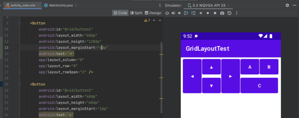
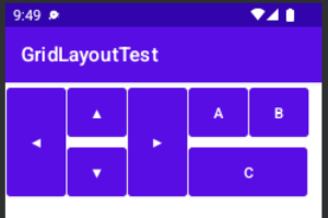
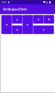 GridLayout完成図
<?xml version="1.0" encoding="utf-8"?>
<androidx.gridlayout.widget.GridLayout xmlns:android="http://schemas.android.com/apk/res/android"
    xmlns:app="http://schemas.android.com/apk/res-auto"
    xmlns:tools="http://schemas.android.com/tools"
    android:layout_width="match_parent"
    android:layout_height="match_parent"
    tools:context=".MainActivity">

    <Button
        android:id="@+id/button1"
        android:layout_width="60dp"
        android:layout_height="120dp"
        android:layout_marginStart="6dp"
        android:text="◀︎"
        app:layout_column="0"
        app:layout_row="0"
        app:layout_rowSpan="2" />

    <Button
        android:id="@+id/button2"
        android:layout_width="60dp"
        android:layout_height="60dp"
        android:layout_marginStart="1dp"
        android:text="▲"
        app:layout_column="1"
        app:layout_row="0" />

    <Button
        android:id="@+id/button3"
        android:layout_width="60dp"
        android:layout_height="120dp"
        android:layout_marginStart="1dp"
        android:text="▶︎"
        app:layout_column="2"
        app:layout_row="0"
        app:layout_rowSpan="2" />

    <Button
        android:id="@+id/button4"
        android:layout_width="60dp"
        android:layout_height="60dp"
        android:layout_marginStart="1dp"
        android:text="A"
        app:layout_column="3"
        app:layout_row="0" />

    <Button
        android:id="@+id/button5"
        android:layout_width="60dp"
        android:layout_height="60dp"
        android:layout_marginStart="1dp"
        android:text="▼"
        app:layout_column="1"
        app:layout_row="1" />

    <Button
        android:id="@+id/button6"
        android:layout_width="120dp"
        android:layout_height="60dp"
        android:layout_marginStart="1dp"
        android:text="C"
        app:layout_column="3"
        app:layout_columnSpan="2"
        app:layout_row="1" />

    <Button
        android:id="@+id/button7"
        android:layout_width="60dp"
        android:layout_height="60dp"
        android:layout_marginStart="1dp"
        android:text="B"
        app:layout_column="4"
        app:layout_row="0" />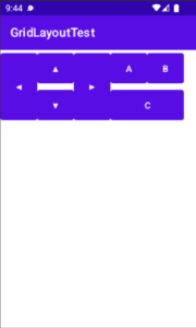
</androidx.gridlayout.widget.GridLayout>今回はこちらの記事にありました、ゲームのコントロール画面をGridLayoutを使って制作していきます。
まず、Design画面で今回はやった方が早いので、Design画面で行います。
GridLayoutをComponentにドラックアンドドロップします。
デフォルトでConstraintLayoutが入っているのでコードからこのように消して書いても同じようになります。
<androidx.gridlayout.widget.GridLayout xmlns:android="http://schemas.android.com/apk/res/android"
    xmlns:app="http://schemas.android.com/apk/res-auto"
    xmlns:tools="http://schemas.android.com/tools"
    android:layout_width="match_parent"
    android:layout_height="match_parent"
    tools:context=".MainActivity">
</androidx.gridlayout.widget.GridLayout>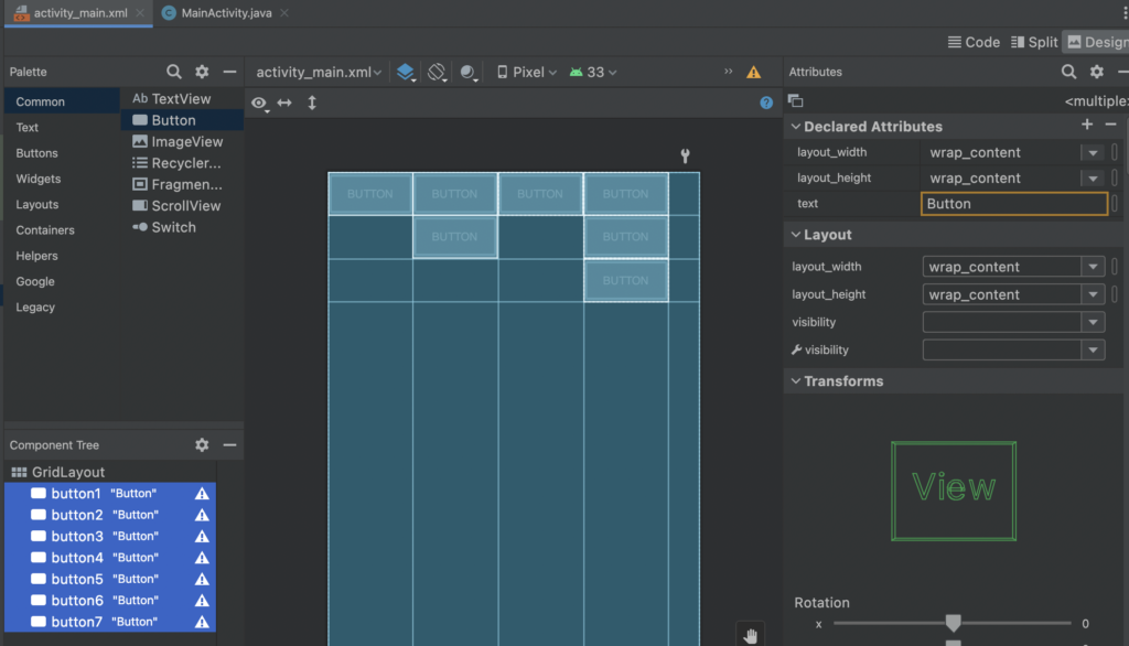
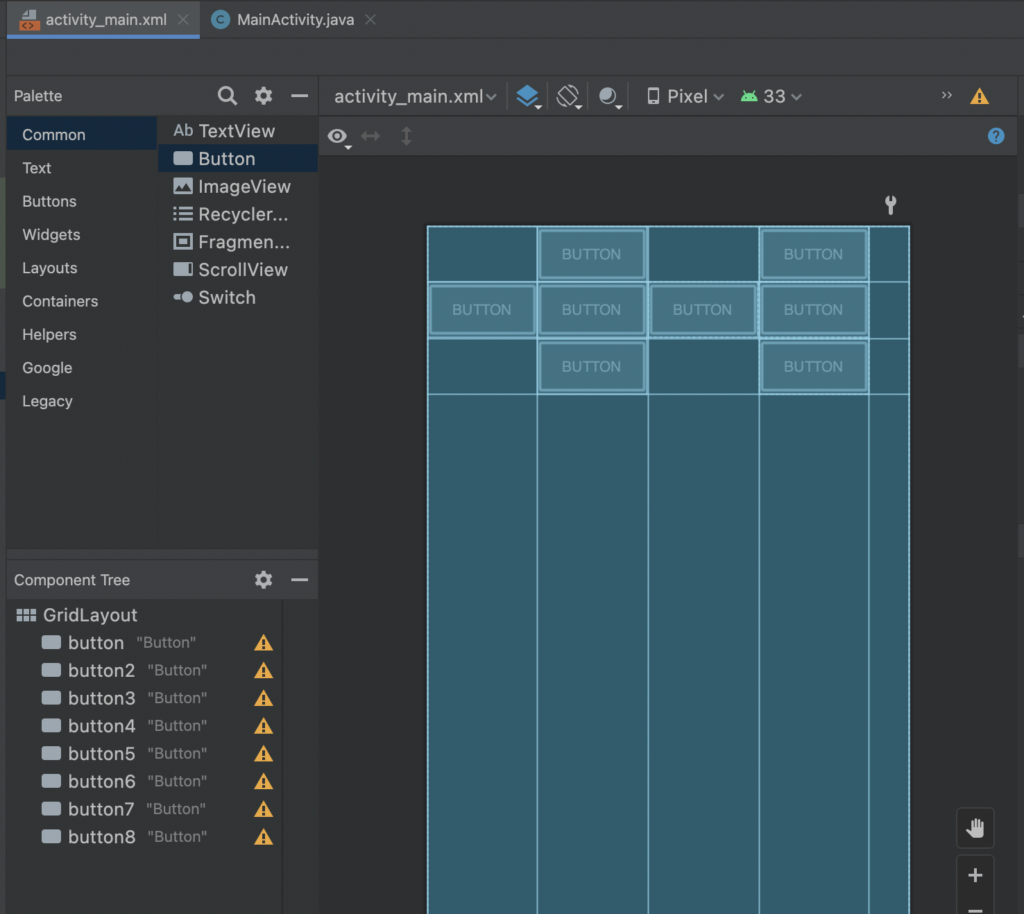
widthを60dpに全てしてください。
ConponentTreeから全選択で一括変更できます。
縦のセルを結合して大きく表示したいので、高さを120dpにします。
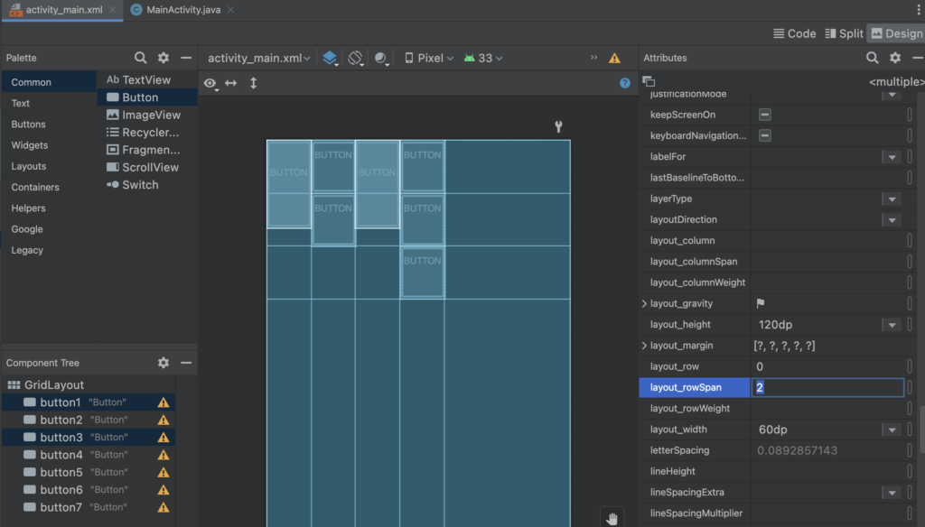
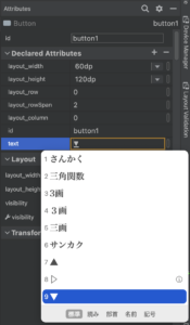
rowとは縦の列のことです。セルを2つ分縦に使いたいので、layout_rowSpanを2にします。Attributesにあります。
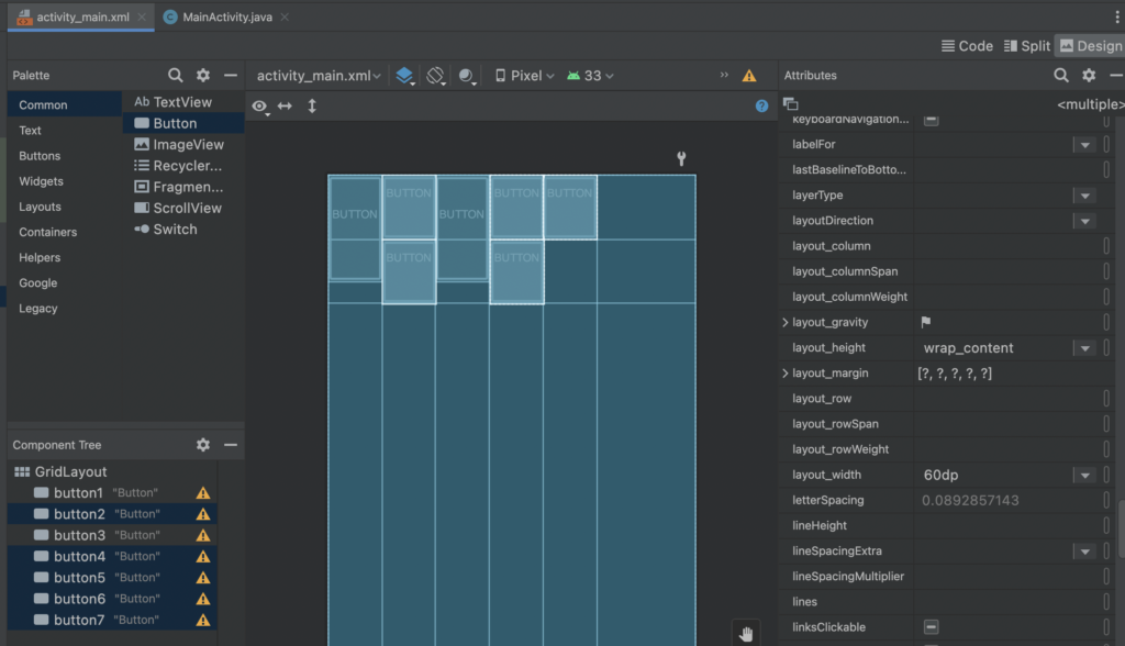
すると、縦の長さを指定しなかったので少しずれて表示されます。なので、残りのセルの縦の長さを60dpにします。
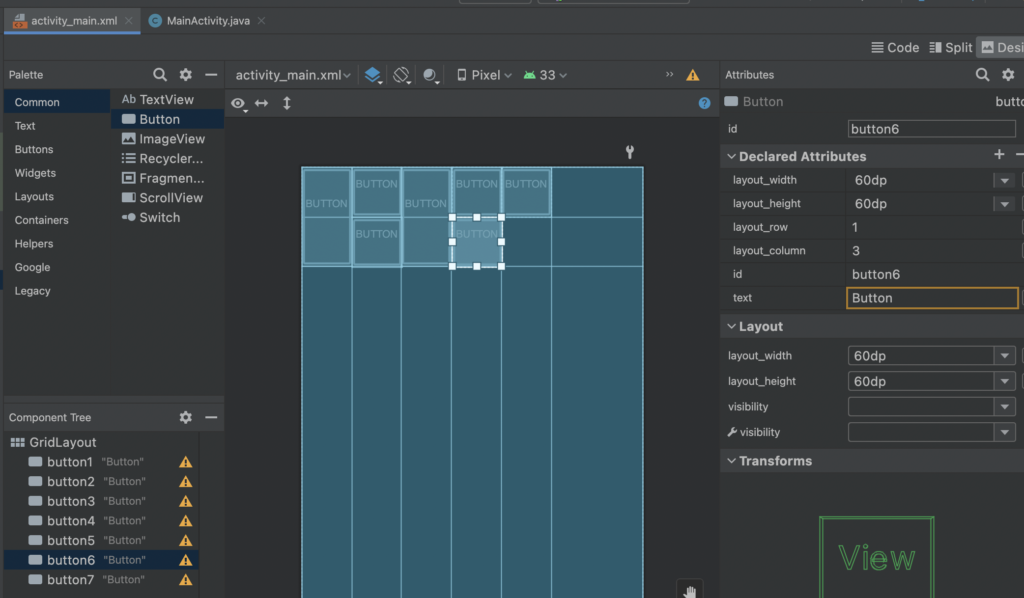
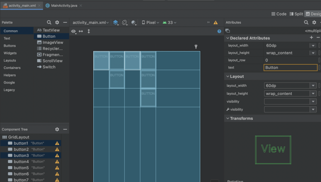
横にセルを広げたいので、widthをbutton6だけ120dpにします。
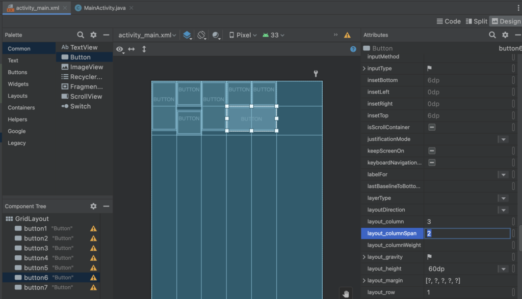
セル2つ分横に使いたいので、layout_columnSpanを2にします。Attributesにあります。
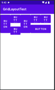
すると、このように辺な空白だったり見栄えが悪いので整えます。
文字数によってこのような見栄えが悪くなるので、短く調整します。
このように変更すれば多少は良くなります。
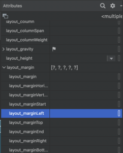
続いて詰められ過ぎているので、marginを設定します。全選択Buttonに対して行い、1dpと指定します。
右側だけ空いてしまうので、最後に、head要素のlayout_Startだけ変更します。
6dpでちょうどよかったです。